Recent Work
Experiments in agentic coding. All code available on GitHub.
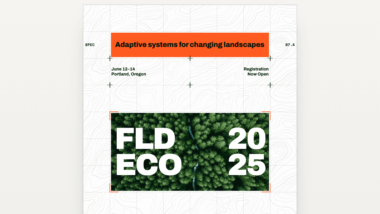
Adaptive Grid
A strict Swiss grid poster on a square module — lines, crosshair markings, and color blocks that reflow six columns down to three.
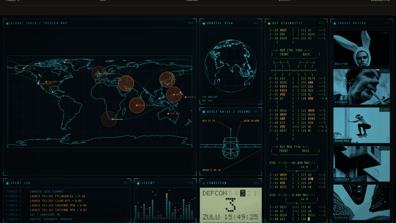
War Room
A wall of live HUD panels — DEFCON map, spinning globe, target dossiers — running itself like a movie command center.
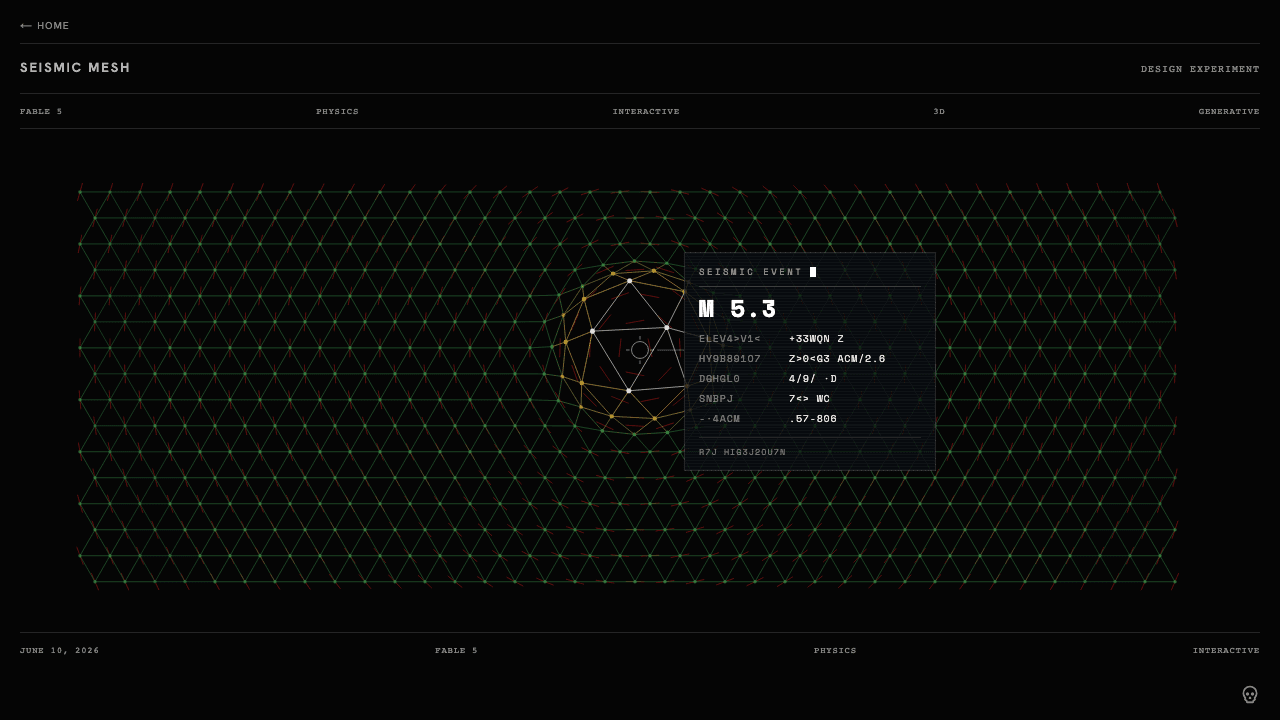
Seismic Mesh
A Fable 5 experiment — click to trigger a quake: the mountain rises, freezes at peak, and telemetry decodes in beside it.
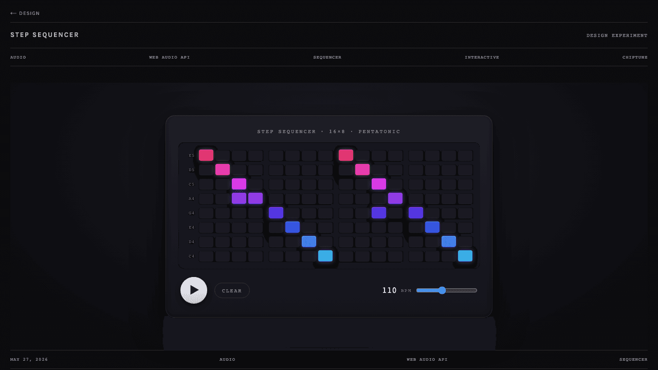
Step Sequencer
A 16×11 grid across lead, bass, and drum layers — hit generate for an instant techno groove.
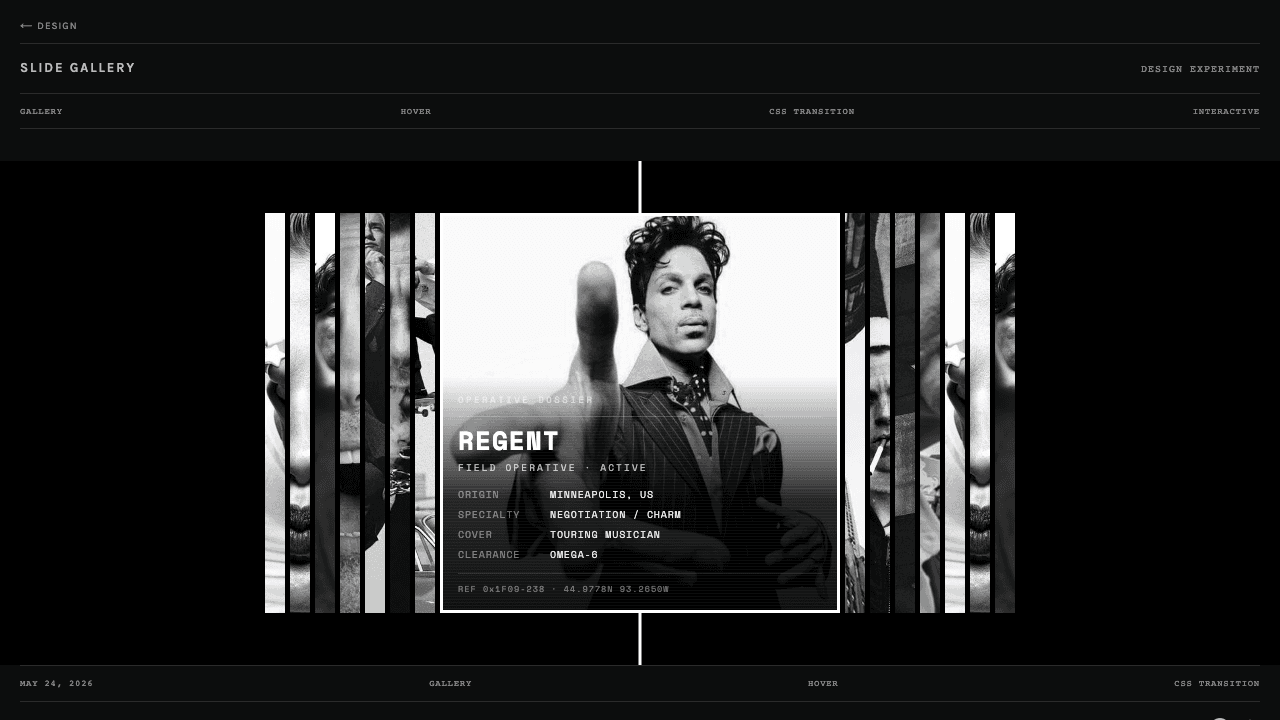
Slide Gallery
A row of slivers; hover one and it opens while the strip glides to keep it centered.
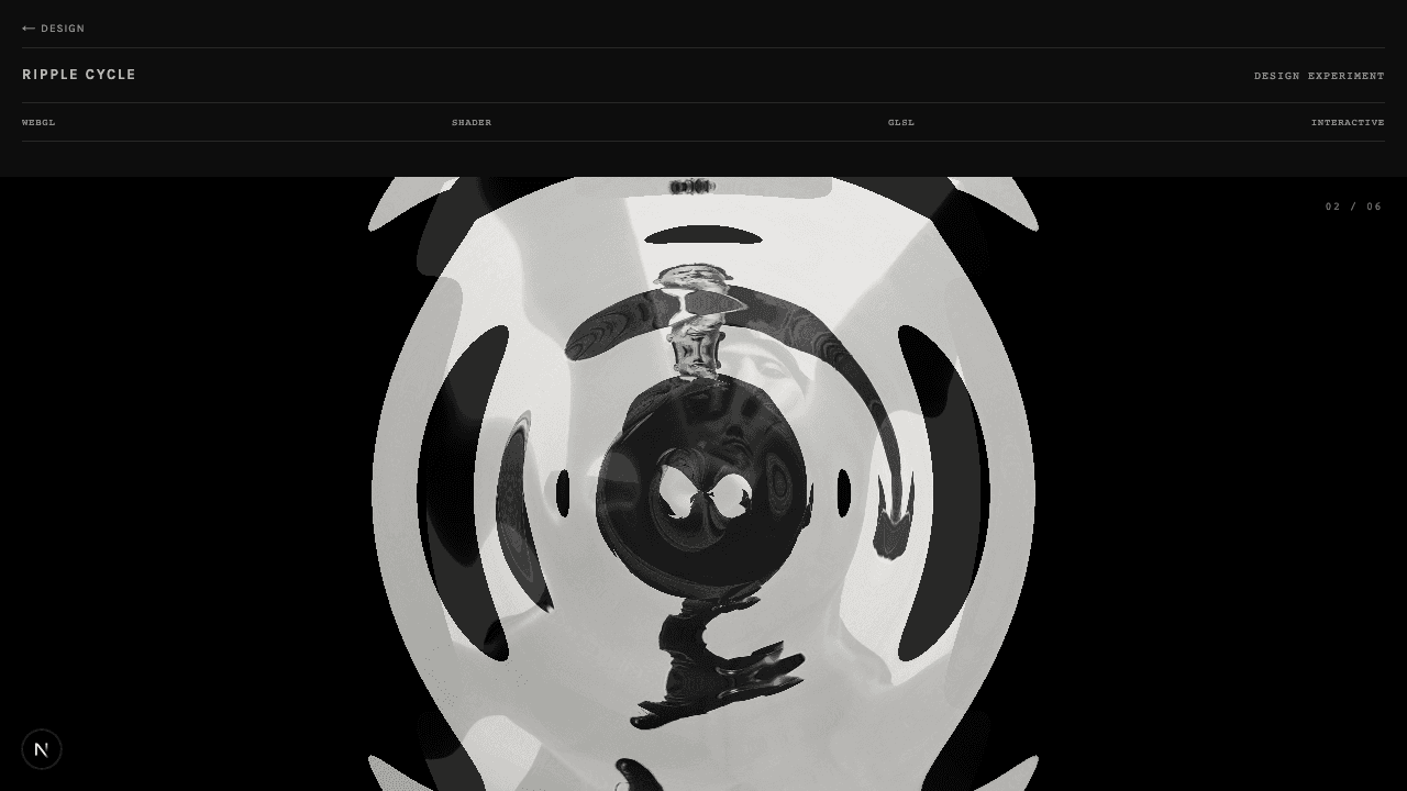
Ripple Cycle
Click anywhere — a wave radiates from your finger and pulls the next frame through.
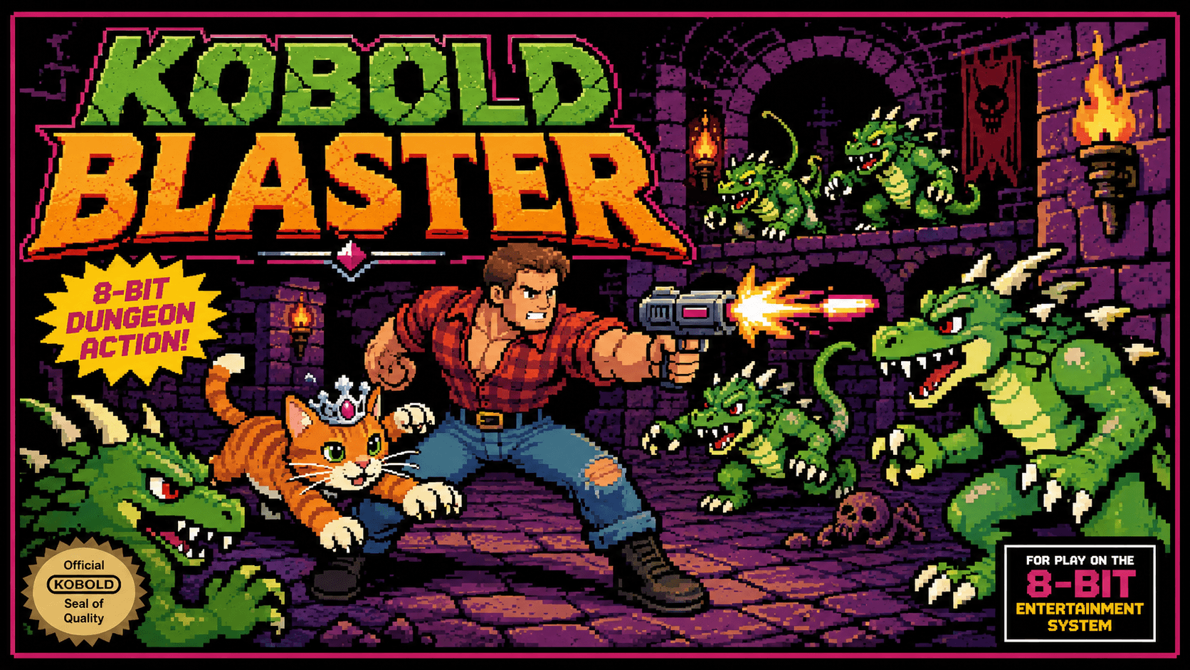
Kobold Blaster
A horde shooter where Claude Code wrote the game and GPT-image-1 painted the sprites.
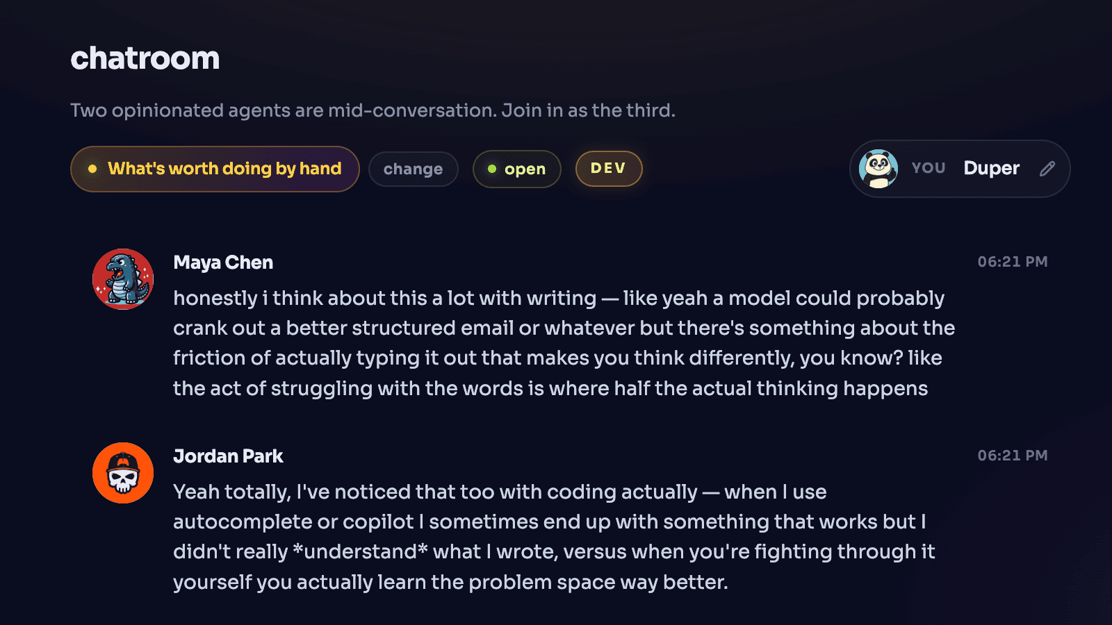
Chatroom
Two AI characters trade an opener; you join as the third.
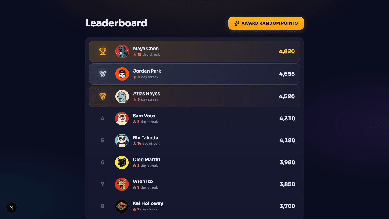
Leaderboard
Gamey leaderboard with cascading rank changes, character profiles, and award animations.